ShopDreamUp AI ArtDreamUp
Deviation Actions
Support My Work
By subscribing you are helping me make more content, make better content, maintain my gear, and help with costs of living. Thank you so much! I love you all
$5/month


Suggested Deviants


Suggested Collections


You Might Like…


Featured in Groups

Description
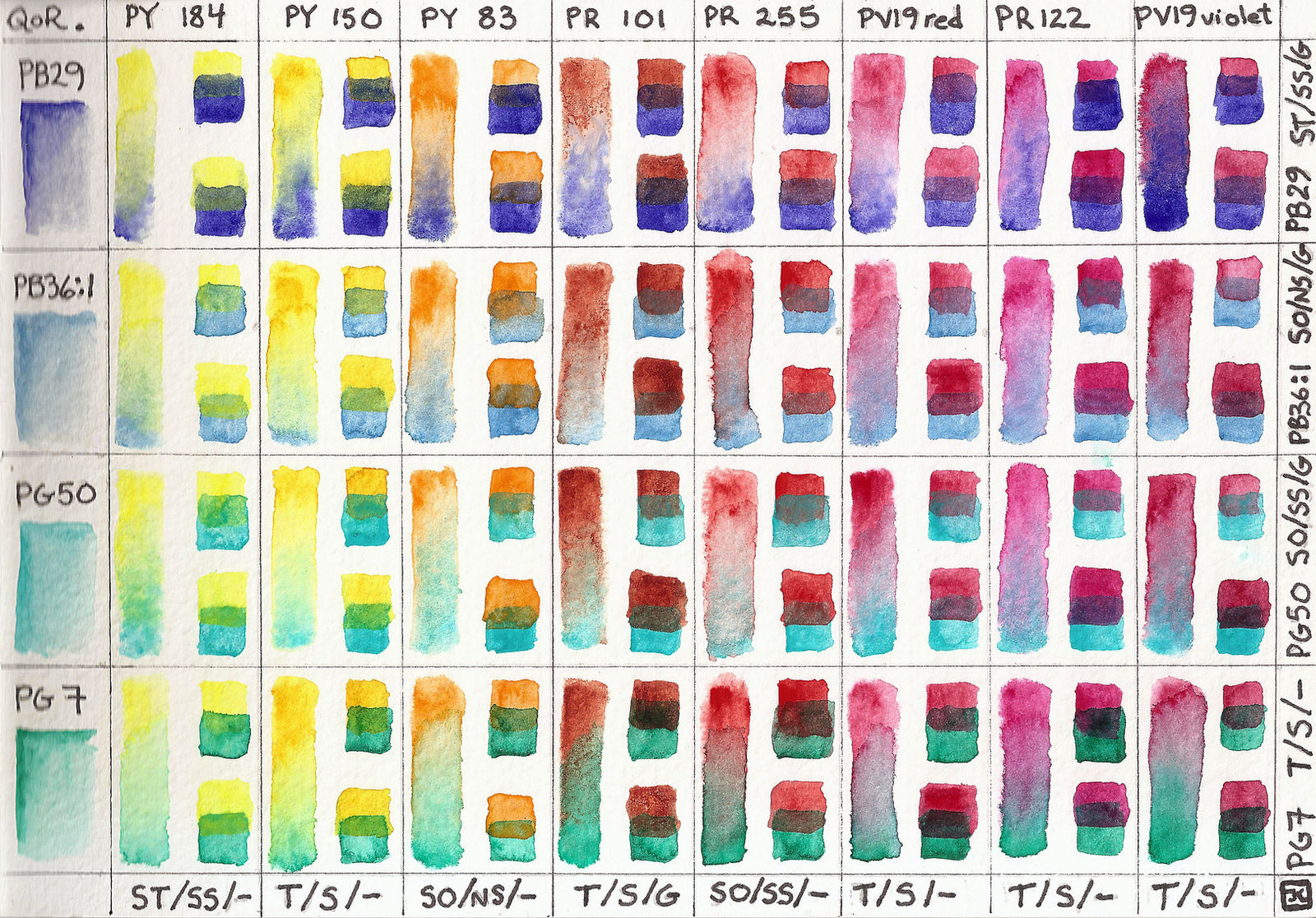
Here are my twelve QoR watercolor pigments used for mixing up all the colors I need. PV49 (cobalt violet) is an incredibly transparent, weak glazing color; it was not included, despite being on my palette.
These are all my possible warm x cool mixes (I've thrown cool yellows and cool red/magentas into the warm category). Nothing's a perfect mixing complement, but a couple 2-pigment glazes come pretty close. However, I have no problem getting very dark near-blacks combining various recipes of three pigments on this chart. I really enjoy playing with color and reading about all the geeky stuff behind our perception of it (Wink)")
In each square on the chart, I've made a wet-in-wet mix of the two colors by charging the cooler (blue/green) color into the warm color on the left side. The top right overlapping pigment squares show how the cooler color appears glazed over the warm color; the bottom right overlapping pigment squares show how the warmer color appears glazed over the cooler (blue/green) color.
I have listed each pigment's opacity (SO=semi-opaque, ST=semi-transparent, T=transparent) / staining (S=staining, SS=semi-staining, NS=non-staining) / granulation (G=granulates, - = none).
8 Warms (cool yellow through violet-magenta):
PY184 Bismuth vanadate yellow -- S/SS/-
PY150 Nickel azo yellow -- T/S/-
PY83 Diarylide yellow -- SO/NS/-
PR101 Transparent red oxide -- T/S/G
PR255 Pyrrole red light (pyrrole scarlet) -- SO/SS/-
PV19 Quinacridone red -- T/S/-
PR122 Quinacridone magenta -- T/S/-
PV19 Quinacridone violet -- T/S/-
4 Cools (purplish-blues through green):
PB29 Ultramarine blue -- ST/SS/G
PB36:1 Cerulean blue, chromium -- SO/NS/G
PG50 Cobalt teal -- SO/SS/G
PG7 Phthalo green, blue shade -- T/S/-
Hope this chart helps you find your own favorite combos!
These are all my possible warm x cool mixes (I've thrown cool yellows and cool red/magentas into the warm category). Nothing's a perfect mixing complement, but a couple 2-pigment glazes come pretty close. However, I have no problem getting very dark near-blacks combining various recipes of three pigments on this chart. I really enjoy playing with color and reading about all the geeky stuff behind our perception of it
In each square on the chart, I've made a wet-in-wet mix of the two colors by charging the cooler (blue/green) color into the warm color on the left side. The top right overlapping pigment squares show how the cooler color appears glazed over the warm color; the bottom right overlapping pigment squares show how the warmer color appears glazed over the cooler (blue/green) color.
I have listed each pigment's opacity (SO=semi-opaque, ST=semi-transparent, T=transparent) / staining (S=staining, SS=semi-staining, NS=non-staining) / granulation (G=granulates, - = none).
8 Warms (cool yellow through violet-magenta):
PY184 Bismuth vanadate yellow -- S/SS/-
PY150 Nickel azo yellow -- T/S/-
PY83 Diarylide yellow -- SO/NS/-
PR101 Transparent red oxide -- T/S/G
PR255 Pyrrole red light (pyrrole scarlet) -- SO/SS/-
PV19 Quinacridone red -- T/S/-
PR122 Quinacridone magenta -- T/S/-
PV19 Quinacridone violet -- T/S/-
4 Cools (purplish-blues through green):
PB29 Ultramarine blue -- ST/SS/G
PB36:1 Cerulean blue, chromium -- SO/NS/G
PG50 Cobalt teal -- SO/SS/G
PG7 Phthalo green, blue shade -- T/S/-
Hope this chart helps you find your own favorite combos!
Image size
3600x2509px 15.54 MB
© 2014 - 2024 shadoj
Comments0
Join the community to add your comment. Already a deviant? Log In